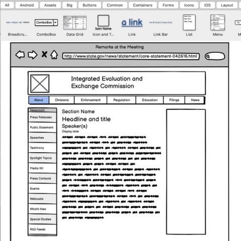
Everyone knows what a wireframe is -- the name practically describes it, it's a sketch that looks like it's made out of wires. Or, more likely, drawn with a pen on a napkin. You probably think it's done with simple boxes and lines because that's easier, right? So when you have a meeting to look at wireframes, and you see some beautiful comps made in photoshop that look just like web pages, with colors and textures and photos and everything, you should be happy -- that's better! Right? Isn't it?
It's not. Send it back, and demand the sketches.
Wireframes are not low-fidelity comps, any more than Starry Night is a blurry picture of a nighttime sky. What's important about a wireframe is not what's left out, it's what's left in -- the key ingredients, the elements that matter. A good wireframe distills the essence of a design into the fewest number of elements possible. If done right, you shouldn't actually need comps -- from the wireframe you can go straight to code. Don't like something? It's easier to change a few lines of CSS than it is to redo a layered Photoshop file, and more representational too. Websites are dynamic things, and the extra detail you get in a comp is just an illusion anyway -- the quicker you get to some sort of prototype, the quicker you'll be able to confidently make the decisions you need to make.
Less is more.
